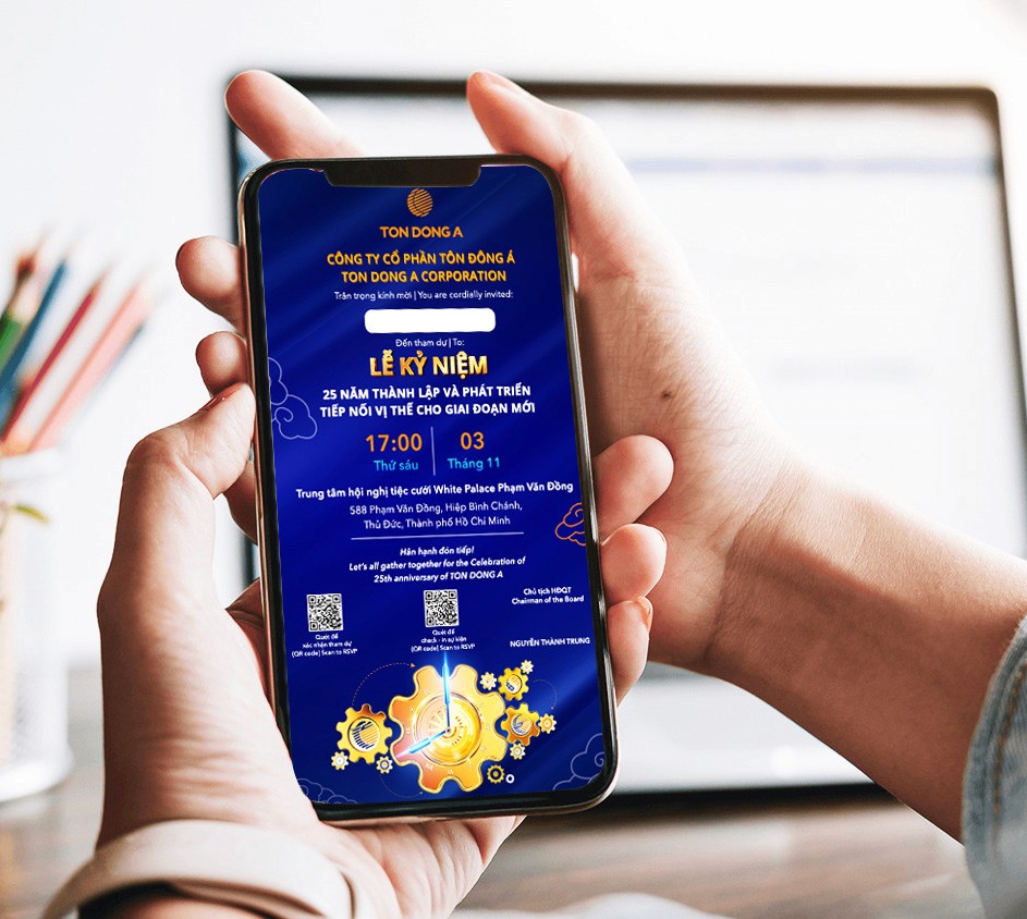
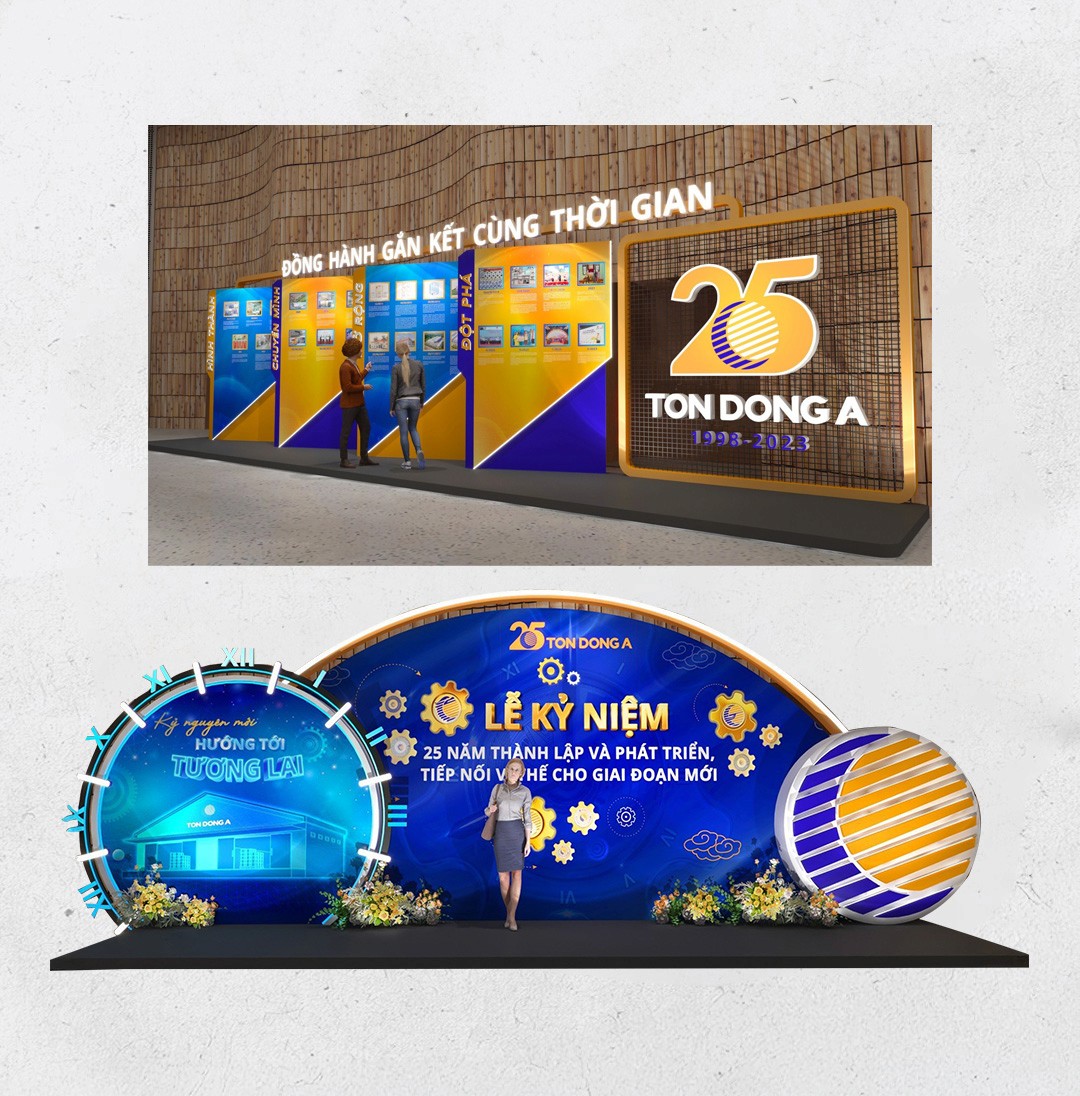
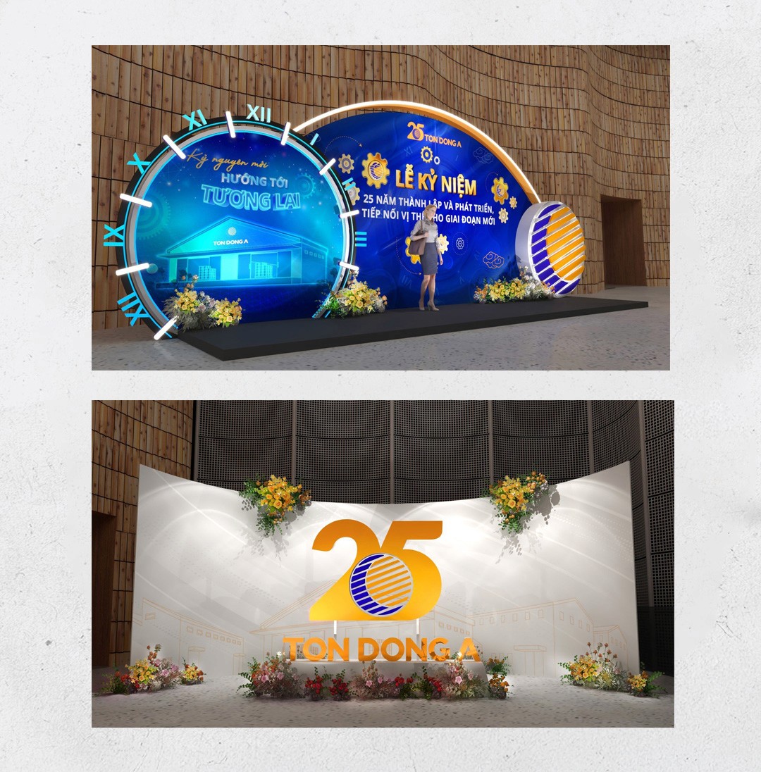
This is a key visual design project I created for Ton Dong A Corporation, one of the leading steel sheet manufacturers in Vietnam. The project was to celebrate the company’s 25th anniversary of establishment and growth. The visual direction was focused on expressing pride, professionalism and the ongoing journey of development.

The client requested that the primary brand color, blue, be used throughout the design to maintain brand consistency. In addition, the concept needed to convey a sense of formality, appropriate for the anniversary celebration, while also reflecting the company’s long-term growth vision.
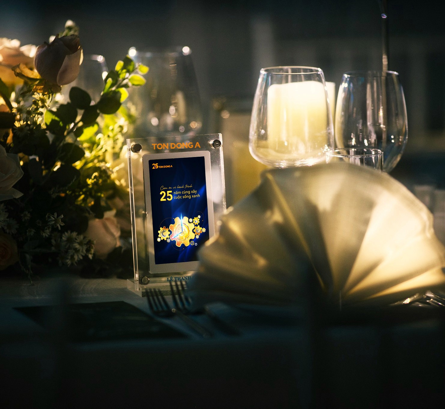
I chose the gear as the core visual element to represent the company’s constant movement and sustainable growth. The central gear was designed as a clock face, symbolizing 25 years of development. Surrounding gears represent the products and achievements the company has produced over the years.
The typography is kept minimal to maintain a formal and elegant feel, allowing the core message to stand out. Blue was used as the primary color to reflect the brand identity, while golden gears were highlighted to add visual contrast.
This project was completed in just over a week and included several key deliverables such as the event invitation, stage backdrop, and door gifts.
The 3D mockup visuals were created by the client’s in-house 3D team, while I was responsible for designing the main artwork.
The client has granted permission for me to showcase these project visuals on my personal website for portfolio purposes.
SEE ALSO